
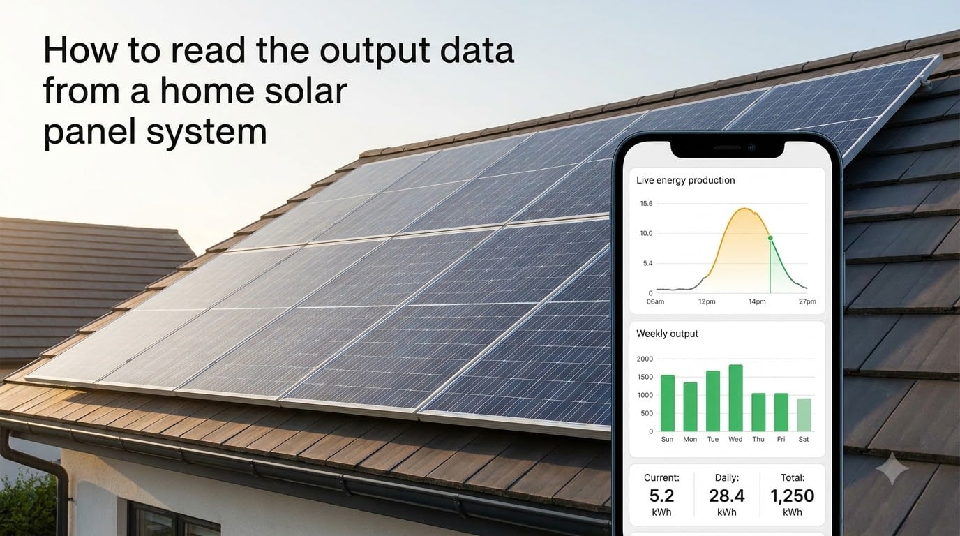
When I first got my solar system, I stared at the inverter screen for ten minutes and understood almost nothing. The numbers blinked, acronyms flashed past, and a tiny green light pulsed like it knew something I didn’t. If you’ve ever felt that same mix of curiosity and confusion, this guide will walk you through exactly how to read the output data from a home solar panel system, from the basics to the dashboards most homeowners actually use.
In this article, I’ll explain what every metric means, where to find your data, how to interpret readings on apps like SolarEdge and Enphase, and how to know whether your system is performing the way it should.
Table of Contents
What Solar Panel Output Data Actually Means?
Solar output data is the information your system collects about how much electricity your panels are producing and how that electricity is being used. Think of it as a fitness tracker for your roof. Every kilowatt and volt the system logs tells a small piece of the story about whether your investment is paying off.
Power Versus Energy: The kW vs kWh Distinction
The first thing to understand is the difference between power (kilowatts, kW) and energy (kilowatt-hours, kWh). Power is how fast your panels are producing electricity at this exact moment. Energy is how much they’ve produced over a period of time.
Imagine filling a bathtub. The flow rate from the tap is your power in kW. The total water in the tub after an hour is your energy in kWh. Your utility bill charges you for kWh, not kW, because kWh is the actual amount of usable electricity you consumed.
Most monitoring dashboards show both. A real-time number might read 4.2 kW right now, while a separate tile shows that you’ve produced 18.6 kWh today. Both matter, but they answer different questions.
DC Power, AC Power, and Why Both Appear
Solar panels produce direct current (DC), but your home runs on alternating current (AC). The inverter is the device that converts one to the other, and it’s where most of your data comes from. You may see two readings: DC power (what the panels are making) and AC power (what your home is actually using). Some inverters, like microinverters from Enphase, report AC output per panel instead.
The gap between DC and AC is normal and small. Most modern inverters hit 96 to 99 percent efficiency. If you see a much bigger gap, that’s worth investigating.
Key Metrics You Will See in Your Solar Data
Every monitoring platform organizes numbers a little differently, but the underlying metrics are essentially the same. Once you recognize them, you can read any dashboard with confidence.
Current Production
This is your live power output in kW. On a sunny midday in summer, a typical 6 kW residential system might peak around 5.4 kW. On a cloudy afternoon, it could drop to 1.1 kW. Current production tells you what your panels are doing right now.
Daily, Monthly, and Lifetime Energy
These are cumulative numbers in kWh. Daily energy is what your panels produced since sunrise. Monthly energy rolls up the days for billing or net metering credits. Lifetime energy is the running total since installation, and it’s the number that matters most for ROI calculations.
A typical 6 kW system in a sunny region might produce 25 to 32 kWh per day in June, and 10 to 14 kWh per day in December. Over a full year, you might see 7,500 to 10,000 kWh lifetime additions per installed kilowatt.
Efficiency and Capacity Factor
Efficiency in solar data usually means how well the system is converting sunlight into electricity compared to its rated maximum. A reading of 95 percent means your panels are performing at 95 percent of the lab-tested benchmark under current conditions.
Capacity factor is a related number, expressed as a percentage, that compares your actual energy production to the theoretical maximum if your panels ran at full rated power 24 hours a day. Most residential systems have a capacity factor between 15 and 25 percent, depending on location and shading. Anything in that range is normal.
Where to Find Your Solar Panel Output Data
There are three places your solar panel output data typically lives. Most homeowners use a combination of all three.
The Inverter Display
The inverter is the box mounted on your garage wall or outside near the meter. Most have a small LCD screen or LED indicators that show core data: current power, daily energy, system status, and sometimes error codes. The display is helpful but limited. You can glance at it to confirm the system is on, but it won’t give you detailed historical data.
To read it, look for a button labeled “Menu” or “OK.” Press it to cycle through screens. One screen will show instantaneous power. Another will show lifetime energy. If your inverter has Wi-Fi, the display may show the network status too.
The Monitoring App or Web Portal
Most modern systems include a smartphone app and a web dashboard. SolarEdge has mySolarEdge, Enphase has the Enphase App, Tesla has the Tesla app for Powerwall users, and SMA has Sunny Portal. Your installer should have set up your login credentials during commissioning.
The app is usually where you’ll spend the most time. It gives you charts, daily totals, alerts, and historical comparisons. Open it once, explore the menus, and bookmark the screens that matter most to you.
The Electric Meter
Your utility meter, often a smart meter on the side of your house, may also display solar-related numbers. If you have net metering, the meter typically shows two readings: exported energy (what your panels sent back to the grid) and imported energy (what you pulled from the grid). Together, these numbers determine your net bill.
How to Read SolarEdge and Enphase Monitoring Apps
SolarEdge and Enphase together power more than 70 percent of US residential solar installations. Knowing how to read their apps covers you for most situations you’ll encounter.
SolarEdge mySolarEdge Dashboard
Open the mySolarEdge app and you’ll land on the site overview. The top of the screen shows current system power in kW, then daily energy in kWh. Below that is a production graph showing output by hour for the current day, with a fainter line showing yesterday’s curve for comparison.
The app also shows per-panel performance if you have SolarEdge optimizers. Tap on a panel icon and you’ll see the specific wattage it’s producing. This is helpful for spotting a single underperforming panel while the rest are fine.
Enphase Enlighten App
Enphase systems use microinverters behind each panel, so the Enlighten app reports AC output per panel rather than a string total. The home screen shows current production, today’s energy, and a seven-day graph.
Tap any panel in the array view to see its individual production. Enlighten uses color coding: green means producing normally, gray means not producing, and red indicates a fault. If a panel shows red, the app usually tells you why in plain language.
Reading Your Solar Meter: Understanding EXP and IMP
One of the most common questions on solar forums is what “EXP” and “IMP” mean on the meter display. This trips up even experienced homeowners, so let’s clear it up.
What EXP and IMP Stand For
EXP is short for export, the electricity your panels sent to the grid. IMP is short for import, the electricity you pulled from the grid. Both are measured in kWh.
If your meter shows EXP = 8.4 kWh and IMP = 3.1 kWh, it means your home sent 8.4 kWh to the grid and pulled 3.1 kWh from the grid today. Net metering credits you for the difference, so the utility owes you 5.3 kWh in this example.
How to Read a Smart Meter Cycle
Smart meters cycle through several screens automatically. Press the button or wait, and you’ll see readings like 001 EXP followed by a kWh number. Some meters show total exports since installation. Others show daily or monthly exports depending on the billing cycle.
Your utility bill reconciles these numbers. If you exported more than you imported during the billing period, you receive a credit. If you imported more than you exported, you owe the difference.
How to Calculate Expected Daily Solar Output
Knowing what to expect makes it easy to spot when something’s wrong. Here’s a simple formula our team uses when verifying a system.
The Basic Formula
Expected daily kWh equals installed system size in kW, multiplied by peak sun hours at your location, multiplied by a performance ratio of 0.75 to 0.85.
For example, a 6 kW system in a location with 5 peak sun hours per day, assuming a 0.80 performance ratio, would produce 6 times 5 times 0.80 equals 24 kWh per day.
Peak sun hours is a number between 3 and 7 depending on where you live. The National Renewable Energy Laboratory publishes free maps that give a precise value for your zip code.
Comparing to Real Numbers
Once you have your expected daily output, compare it to what your app shows. A 10 to 20 percent shortfall on cloudy days is normal. A 30 percent or bigger shortfall under clear skies usually means something needs attention.
Factors That Affect Real-World Solar Panel Output
Real-world output rarely matches the lab rating. Understanding why helps you read the numbers with realistic expectations.
Weather and Cloud Cover
Clouds reduce output, but less than most people expect. Light cloud cover might cut production by 10 to 25 percent. Heavy storm clouds can drop output by 70 percent or more. Rain itself actually cleans the panels, which often boosts output the next day.
Temperature
Solar panels lose efficiency as they get hotter. Most panels have a temperature coefficient of around 0.3 to 0.5 percent per degree Celsius above 25 degrees. On a 35 degree Celsius summer day, that can mean a 3 to 5 percent drop in output. Cool, sunny spring days often produce the best numbers of the year.
Shading, Dirt, and Panel Angle
Even partial shading of one panel can reduce string output significantly, which is why optimizers and microinverters are popular. Dirt buildup, bird droppings, and snow all reduce production temporarily. The angle and orientation of your roof also matters: south-facing panels at 30 to 40 degrees tilt produce the most in the northern hemisphere.
Troubleshooting Performance Issues From Your Data
The numbers tell a story. When output drops unexpectedly, you can often narrow down the cause by reading the data carefully.
Sudden Drops to Zero
If your app shows zero production during daylight hours, check the inverter display first. A solid red light or a fault code usually points to a grid outage, a tripped breaker, or an inverter shutdown. Most inverters also log the specific fault. Common codes include “AC voltage out of range,” “ground fault,” or “isolation fault.” These usually require a professional to diagnose and clear.
Gradual Declines Over Months
A slow drop of 1 percent or so per year is normal panel degradation. A drop of 5 to 10 percent over a few months is not. This kind of decline usually points to a failing component, dirt accumulation, or new shading from a growing tree. Compare your monthly totals to the same month last year to spot the trend.
One Panel Underperforming
If your monitoring app shows per-panel data and one panel is producing 40 to 60 percent less than its neighbors, you likely have a specific issue: a bad connection, a failing optimizer, micro-cracks, or shading from a new object. This is the value of panel-level monitoring. Your installer can swap or repair that single panel rather than guess at the whole system.
Frequently Asked Questions
How do I read solar panel output?
Read solar panel output by checking three places: your inverter display for real-time power, your monitoring app for daily and historical totals, and your utility meter for export and import readings. Live power is shown in kilowatts (kW) and energy totals are shown in kilowatt-hours (kWh).
What is the actual output of a 400W solar panel?
A 400W panel rated under Standard Test Conditions typically produces between 280W and 360W in real-world conditions. The actual output depends on sunlight intensity, temperature, angle, and shading. Over a full day with 5 peak sun hours, expect roughly 1.6 to 1.8 kWh per panel.
What does EXP and IMP mean on my solar meter?
EXP stands for export, the electricity your panels sent to the grid in kWh. IMP stands for import, the electricity you pulled from the grid in kWh. The difference between the two is your net energy position for the billing cycle and determines whether you owe money or receive a credit.
What is the best app to monitor solar panels?
The best app depends on your inverter brand. SolarEdge systems use mySolarEdge, Enphase systems use the Enphase App, Tesla Powerwall uses the Tesla app, and SMA systems use Sunny Portal. All four are free and provide real-time production, daily totals, and historical charts.
What is the 33% rule in solar panels?
The 33 percent rule is shorthand for the typical ratio of a panel’s actual real-world output to its lab-rated maximum. On average, panels produce about one-third of their rated wattage when averaged across a full day because of angle, weather, and temperature losses. A 400W panel averaging 130W to 150W across the day is normal.
How can I tell if my solar panels are working properly?
Check your monitoring app against the expected daily output for your system size and location. If production is within 15 to 20 percent of expected on a clear day, your panels are working well. Sudden drops to zero, single-panel underperformance, or steady declines over months all signal a problem worth investigating.
Why is my solar output lower than expected?
Solar output can be lower than expected because of cloudy weather, high panel temperatures, shading from trees or buildings, dirt and debris, a failing component, or simply the season. Compare your actual output to the same date last year and to nearby homes if possible. If the gap is consistent and unexplained, contact your installer for a diagnostic check.
Final Thoughts
Learning how to read the output data from a home solar panel system turns you from a passive observer into an informed owner. After the first few weeks, the numbers stop looking like noise and start telling you a clear story about your home’s energy production. Check your app once a week, glance at the meter once a month, and keep rough notes about anything unusual.
Your solar system is a long-term investment that should pay you back for 20 years or more. The five minutes a week you spend reading your data is the easiest insurance you can buy to make sure it does.