
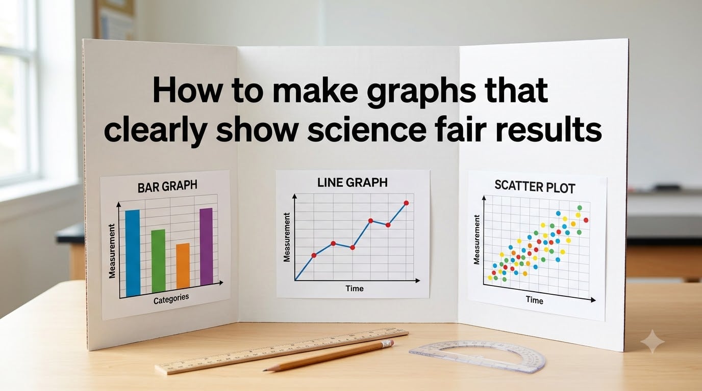
I have judged science fairs for eight years, and I can tell you in five seconds whether a graph is clear. That is the test every project must pass, and it is exactly the problem this guide solves. If you want to know how to make graphs that clearly show science fair results, the answer comes down to choosing the right chart type, placing your variables on the correct axes, labeling everything with units, and making the visual design clean enough for a tired judge to read at a glance.
In this guide, I walk you through the same checklist I share with students I mentor. You will learn which graph type fits your data, where the independent and dependent variables go, and the small visual tweaks that separate a winning board from an average one. I also cover common mistakes and the digital tools that make the whole process faster.
Table of Contents
What Makes a Science Fair Graph Clear and Effective?
A clear science fair graph communicates one main finding in under five seconds. Before you worry about colors or chart style, focus on the three things judges look for first: the title, the axes, and the units of measurement.
Your graph should answer the central question of your experiment without any extra explanation. If a judge has to lean in, squint, or ask what the numbers mean, the graph has failed its job. I coach students to treat the graph like a billboard, not a spreadsheet.
The key ingredients of an effective science fair graph are simple. You need a descriptive title that states the relationship you measured, labeled axes with the variable name and unit of measurement, evenly spaced tick marks, accurate data points, and a legend when you include more than one data series.
Choosing the Right Graph Type for Your Data
Choosing the right graph type is the single biggest decision you will make. Each chart tells a different story, and using the wrong one is the most common reason graphs look confusing.
Here is the framework I teach. Match your data to the question you are answering.
Bar Graph: Compare Values Between Groups
Use a bar graph when you are comparing different categories or groups. For example, plant growth across three fertilizer brands, or test scores between four study methods. The height of each bar makes comparisons instant.
A bar graph is the safest choice for most elementary and middle school projects. It works for any data set with distinct categories and a numerical measurement.
Line Graph: Show Trends Over Time
Use a line graph when your independent variable is time or a continuous sequence. Tracking temperature every hour, plant height each day, or reaction rate over five minutes all call for a line graph. The line shows direction and rate of change.
If your data has more than one trial or condition, plot multiple lines and label them. Judges like seeing how a trend holds up across repeats.
Pie Chart: Show Percentage Breakdown
Use a pie chart only when your data adds up to 100 percent. Examples include the percentage of students who picked each answer on a survey, or the share of a budget spent in each category. Pie charts with too many slices become unreadable, so cap yourself at six slices.
Scatter Plot: Display Relationships Between Two Variables
Use a scatter plot when you want to show how two continuous variables relate to each other. Plotting height versus weight, or sunlight exposure versus plant mass, calls for a scatter plot. Adding a trend line helps judges see the relationship at a glance.
Scatter plots are the standard for advanced projects where students run a Chi-Square test or calculate correlation.
Setting Up Your Axes: What Goes Where
Setting up your axes correctly is where most students lose easy points. The rule is simple and never changes. Place your independent variable on the x-axis (horizontal) and your dependent variable on the y-axis (vertical).
The independent variable is the one you change on purpose. The dependent variable is the one you measure to see what changed. If you water plants with different amounts of water, the amount of water goes on the x-axis. The plant height you measured goes on the y-axis.
Include the units of measurement on each axis label. Write the variable name followed by the unit in parentheses, like “Water added (mL)” or “Plant height (cm).” This small detail separates a polished graph from an amateur one.
Space your tick marks evenly and pick intervals that make the data easy to read. If your values range from 0 to 47, mark every 5 units rather than every 3.7. Round numbers help judges read the graph quickly.
Labeling Your Graph With Titles, Units, and Legends
Labeling is the secret to graphs that clearly show science fair results. A judge should be able to read your title and instantly know what you tested, what you measured, and what you found.
Write your title as a sentence that describes the relationship, not a generic label. Instead of “Plant Growth,” write “Fertilizer B produced 23 percent taller plants than the control after 14 days.” The title does the talking for you.
Add a legend whenever you plot more than one data series. Place the legend inside the graph area where it does not cover any data points. Keep it short, and use symbols or colors that match the lines or bars.
Finally, add a short caption beneath the graph on your board that explains what the viewer is seeing in plain language. Two sentences is plenty.
Step-by-Step: How to Make Graphs That Clearly Show Science Fair Results?
Here is the exact process I walk through with every student. Follow these steps and your graph will meet or exceed the standard at any regional science fair.
Step 1: Organize your data in a table first. Before you open any software, write your data in a simple table with one column per variable. This makes charting easier and helps you spot outliers.
Step 2: Pick the graph type that matches your question. Refer back to the chart type framework above. Comparing groups calls for a bar graph, time-based data calls for a line graph, and two continuous variables call for a scatter plot.
Step 3: Place variables on the correct axes. Independent variable on x, dependent variable on y. Always. This is non-negotiable for science fair projects.
Step 4: Label every axis with the variable name and unit. Do not assume anyone knows what your numbers represent. Spell it out, every time.
Step 5: Add a descriptive title and, if needed, a legend. Write a title that states your main finding. Add a legend when you have multiple data sets or color codes.
Step 6: Check your data points for accuracy. One wrong number can sink your project. Compare every plotted point against your data table before you print.
Step 7: Print at the right size for your board. Your graph should be large enough to read from three feet away. If a judge needs to step closer than that, your graph is too small.
Visual Design Tips to Make Your Graph Stand Out
Visual appeal is the difference between a graph that gets a passing nod and one that makes a judge stop and look twice. The good news is that a few small choices handle most of the work.
Use color coding with purpose, not decoration. Pick one color for each condition and stick with it across every graph on your board. Avoid rainbow palettes, which distract more than they inform.
Choose clean, readable fonts. Sans-serif fonts like Arial or Calibri read best from a distance. Use 14-point font for axis labels and 18-point for the title. Anything smaller will look blurry on a printed board.
Leave white space around your graph and inside the plot area. Crowded graphs confuse the eye. Remove gridlines if they do not help readability, and keep your background white or very light.
For advanced projects, add error bars to show the range of your data across multiple trials. Error bars signal that you understand experimental variation, and they earn respect from judges who review science projects every year.
Common Mistakes to Avoid on Your Science Fair Graph
Most science fair graphs lose points for the same handful of reasons. Avoid these, and you are already ahead of the average entry.
Do not skip the units of measurement. A graph labeled “Temperature” without “(°C)” is incomplete. Judges mark this down every time.
Do not put the dependent variable on the x-axis. This swap is the most common error I see, and it shows judges that the student did not understand their own experiment.
Do not use a pie chart for non-percentage data. Pie charts only work when slices add up to 100 percent. If yours do not, switch to a bar graph.
Do not crowd your graph with extra information. Remove chart borders you do not need, drop unnecessary decimals, and keep the focus on the data.
This brings us to the 5 second rule in science fair judging. A judge should be able to glance at your graph for five seconds and walk away knowing your main finding. If they cannot, your graph needs a clearer title and a cleaner design.
Digital Tools for Creating Science Fair Graphs
You do not need expensive software to make a clean graph. The free tools available today produce results that would have impressed judges a decade ago.
Google Sheets is the most accessible starting point. It handles bar, line, pie, and scatter plots well, and it is free with any Google account. For students who want more design control, Canva offers polished graph templates you can customize with your data.
For advanced projects, consider Desmos for math-heavy visualizations or Plotly for interactive charts. Microsoft Excel remains a solid choice if your school provides a license. Pick one tool, learn its basics, and stay consistent across all your graphs.
Frequently Asked Questions
How to make a graph for a science fair project?
Start by organizing your data in a table. Choose a graph type that matches your question: bar graphs for comparing groups, line graphs for trends over time, scatter plots for relationships between two variables, and pie charts for percentage breakdowns. Place your independent variable on the x-axis and your dependent variable on the y-axis, then label both axes with the variable name and unit of measurement. Add a descriptive title that states your main finding, and include a legend when you plot multiple data series.
How to graph science results?
Open your data table and identify which variable you changed (independent) and which variable you measured (dependent). Place the independent variable on the x-axis and the dependent variable on the y-axis. Plot each data point accurately, label both axes with units, and add a clear title. If you have multiple trials, plot each trial and include error bars to show variation. Review every point against your table before printing.
How to make a graph visually appealing?
Use color coding with a clear purpose, assigning one color per condition and keeping it consistent across your entire board. Pick a clean sans-serif font at 14 points for labels and 18 points for the title. Leave white space around the plot area, remove unnecessary gridlines, and print large enough that the graph reads from three feet away. Avoid rainbow palettes and decorative effects that distract from the data.
What is the 5 second rule in science fair?
The 5 second rule says a judge should be able to glance at your graph for five seconds and immediately understand your main finding. If your title, axes, and labels are clear, the graph passes. If a judge has to lean in, squint, or ask what the data shows, the graph has failed. Use a descriptive title, label all axes with units, and keep the design clean to pass the test.
Final Thoughts on Making Graphs That Clearly Show Science Fair Results
Learning how to make graphs that clearly show science fair results is less about software and more about discipline. Pick the chart type that matches your data, place your variables on the correct axes, label every element with units, and design for the five-second test. Do this and your graph will do its job, which is letting your science speak for itself.
Before your final print, run through this checklist one more time. Title states the finding. Axes are labeled with units. Data points match your table. Font is large enough to read from three feet away. If all four are yes, you are ready to present with confidence.